Helix Crypto UI Kit
A crypto and Web3 design system built end to end: token foundations, a 320+ component library and 20 production screens covering exchange, wallet, DeFi and NFT products — shipped as a Figma kit with a working HTML preview. It is not client work.
- Context
- Crypto / Web3 UI kit
- Role
- Token system, components, screens
- Scope
- 320+ components · 20 screens
- Status
- Self-directed
- Evidence
- Live preview + Figma build scripts
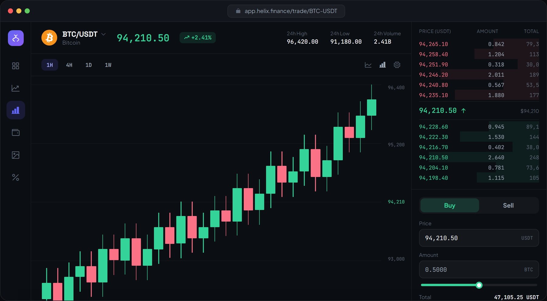
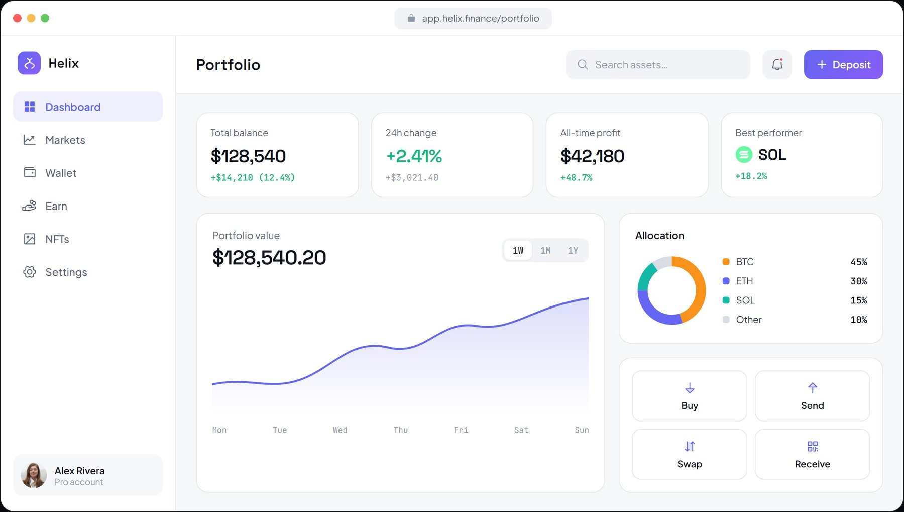
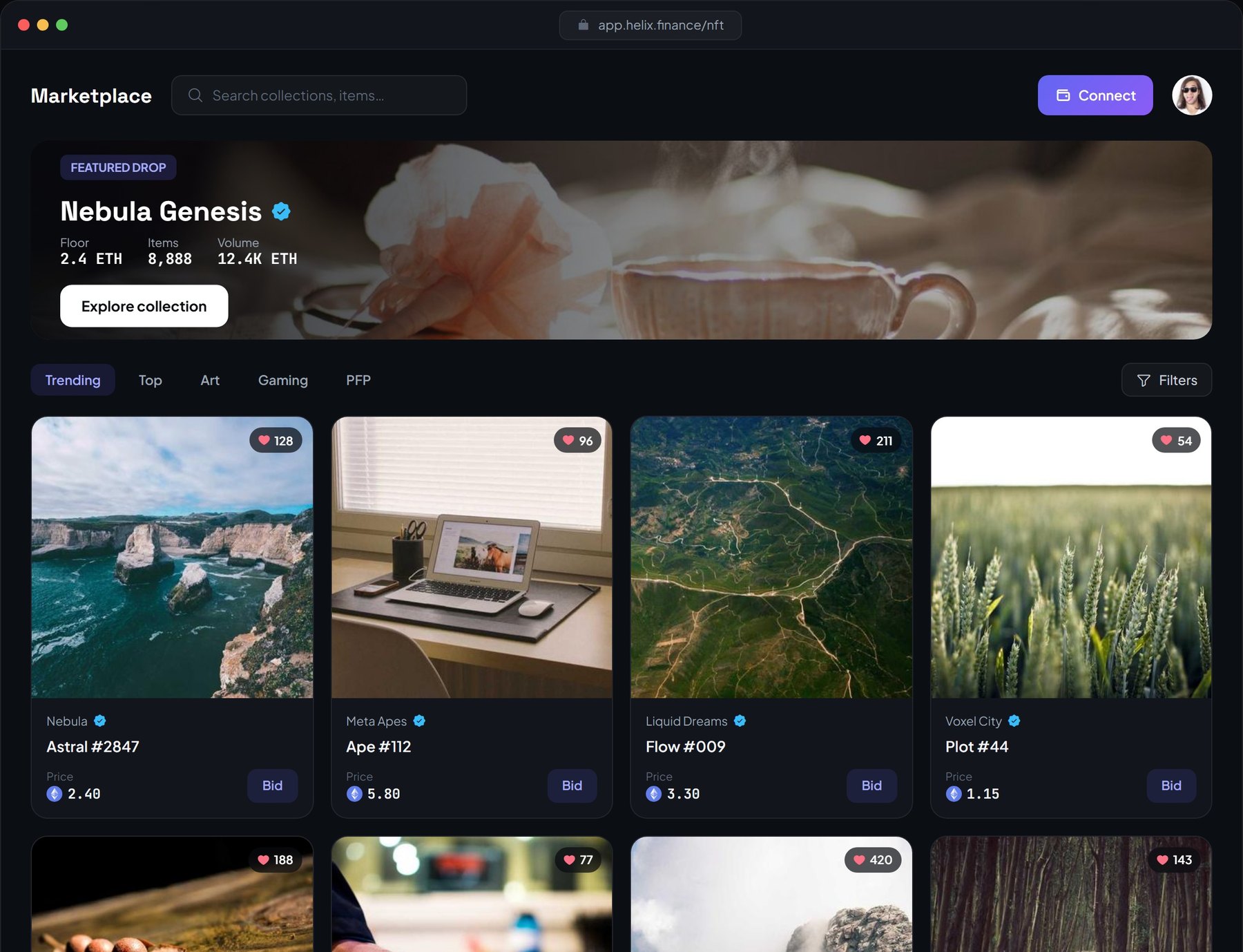
Screens captured from the live build.
Direct screenshots of the deployed product — no reconstructed mockups — so density, states and theme variants can be judged exactly as they ship.
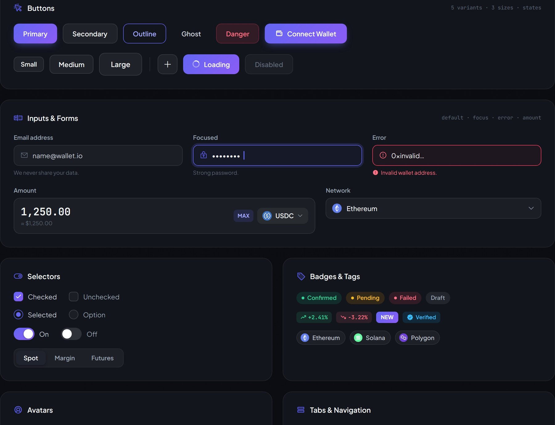
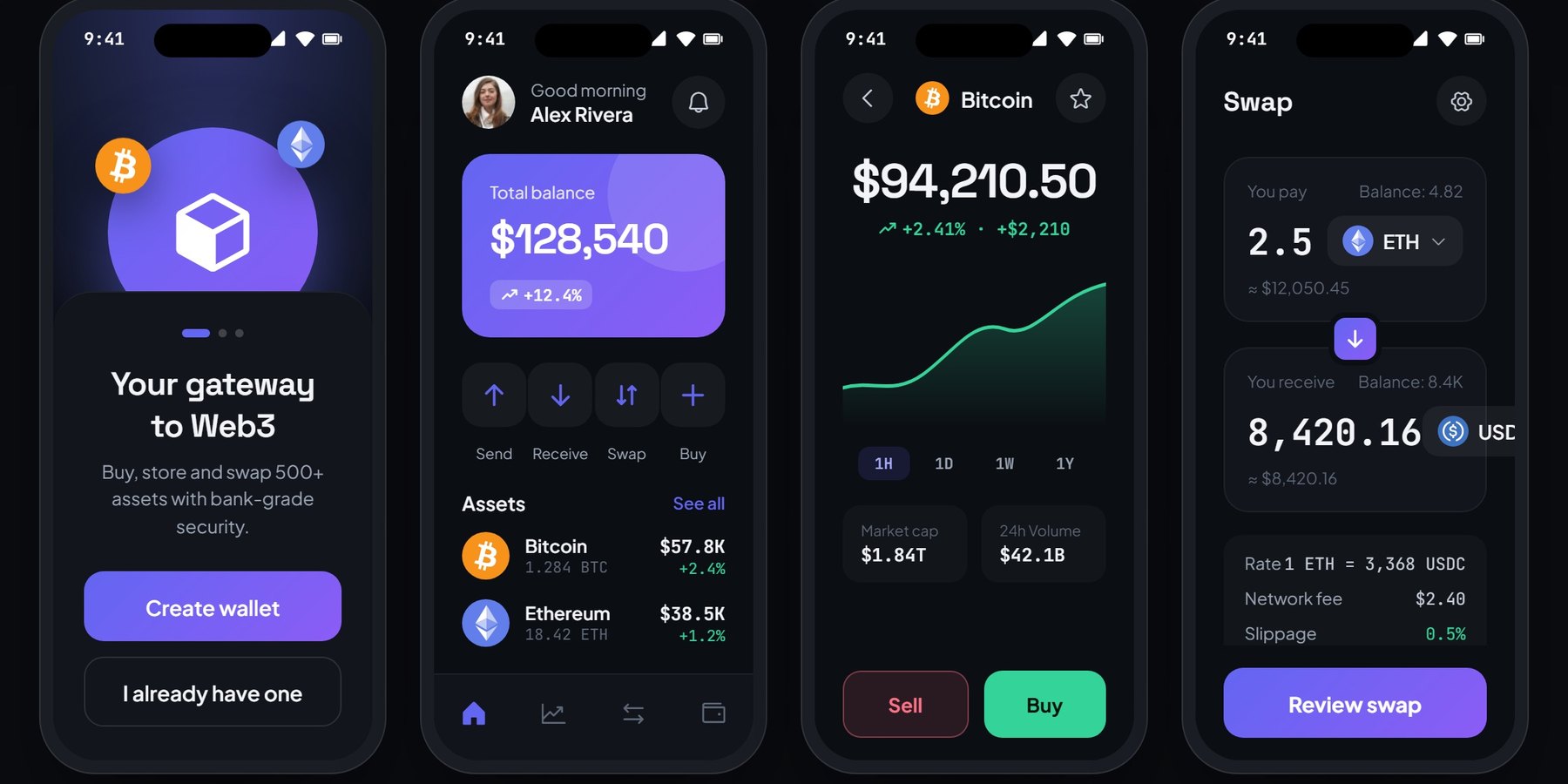
A realistic product problem, not a decorative dashboard brief.
Crypto products are dense by nature: live prices, order books, wallet balances, token metadata and risk states all compete for the same screen. Most kits solve the visual layer and stop there, leaving the hard part — keeping every state legible once the data is real and the layout is under pressure — to whoever builds it.
Product framing, interface design and working prototype.
I defined the token foundation, built the component library and screen set, wrote the Figma build scripts that generate variables, styles, variants and screens, and produced the HTML preview that serves as the live demo.
The interface is organized around decisions and state changes.
The concept is intentionally interactive so the design can be judged against a real task flow instead of only a polished screenshot.
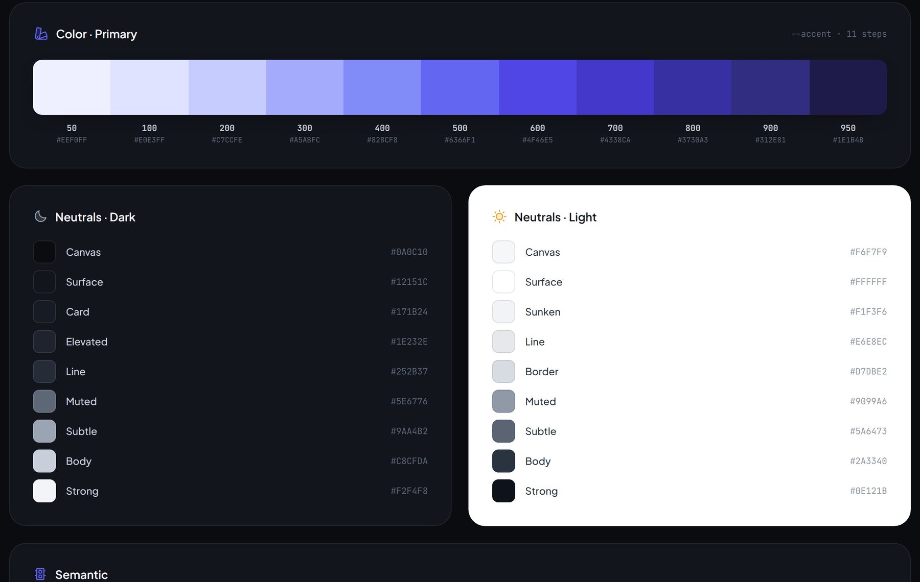
An accent ramp from 50 to 950, dark and light neutrals, semantic success/danger/warning/info, a 4pt spacing scale and a radius scale exist before a single component does.
Buttons, inputs, selectors, badges, tables, charts and wallet cards ship as variants with default, focus, error, loading and disabled states built into the library.
Twelve desktop and eight mobile screens cover the trading terminal, portfolio dashboard, markets, NFT marketplace, wallet, staking, transactions and settings.
Both modes resolve against the same token names, so a dark trading terminal and a light portfolio dashboard are two expressions of one system rather than two designs.
System choices are tied to operational use.
The goal is not to claim invented conversion or efficiency gains. The case shows the reasoning and interaction model that can be evaluated directly in the live prototype.
A monospaced face is reserved for prices, balances and order-book figures so columns align and scanning a dense table stays calm.
Success, danger, warning and info are the only saturated colors allowed to mean something; the accent stays reserved for action and focus.
Every component has to earn its place inside one of the twenty screens, which keeps the library honest instead of a gallery of pretty isolated parts.